Three clients, three different needs
Premium and understated, bold and minimalist. Each solution was designed for the client's own situation, not from a ready template. The same person behind each one.
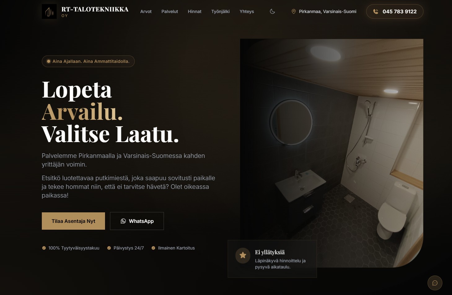
RT-Talotekniikka Oy · HVAC
When a new company must not look new
A dark premium theme for a new HVAC company, where trust was built through openness.
Open case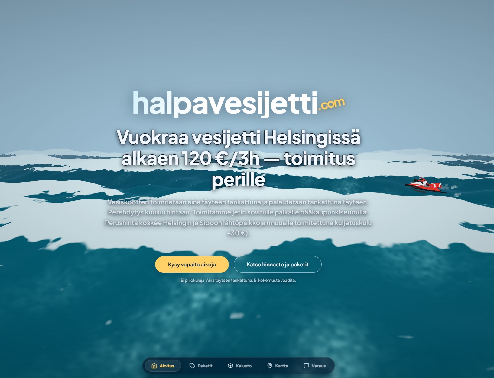
Halpavesijetti.com · Leisure rental
When "cheap" had to look anything but cheap
A bold, eye-catching site that turns a low price into a competitive advantage instead of a source of doubt.
Open case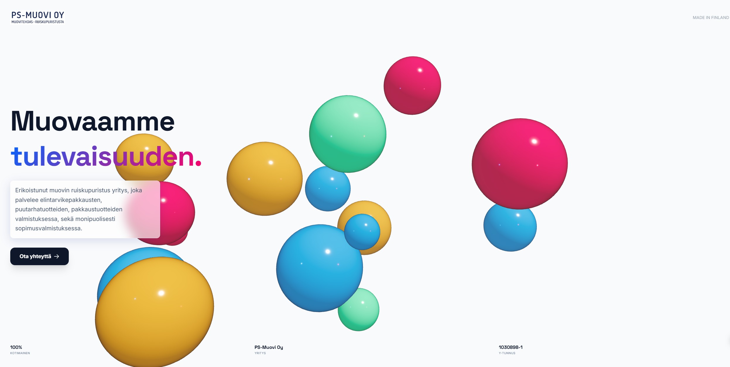
PS-muovi Oy · Industry
When less was the only right answer
A minimalist business-card site for an industrial B2B buyer who has no time for a sales pitch.
Open caseWhen a new company must not look new
The company was a couple of months old. The expertise was eight years old. The site had to look like the latter.
RT-Talotekniikka called in the spring. Two HVAC professionals had just founded their own company, but "just founded" and "new in the trade" are two different things. Together they had over eight years of plumbing work behind them, but the business ID was only a few months old. The problem was familiar to many small entrepreneurs: how to look reliable when there is no wall of references yet and no ten years of the same logo on site signs?
The solution was not to add text in the hope of convincing. Quite the opposite. We cut the explaining and let what remained speak for itself: a dark, editorial look, short and direct sentences ("Stop guessing. Choose quality.") and above all real photos from real sites. Not a single stock photo of a smiling plumber with a tap, but finished bathroom and WC installations as they really turn out.
Trust was also built with numbers that needed no polishing: the hourly rate right on the page, example prices for the most common jobs and an honest note that materials and waste fees are charged separately. No hidden surprises. This company did not want to be the one people complain about.
Technical implementation
| Area | Solution |
|---|---|
| Visual line | Dark premium theme, editorial typography, plenty of white space instead of explaining |
| Content structure | Clear path: Values, Services, Prices, Work quality, Contact |
| Trust signals | Registrations (contractor's obligations, prepayment register, liability insurance) shown openly |
| Imagery | Real, unstaged site photos instead of stock images |
| Conversion path | Phone and WhatsApp highlighted right in the hero area, a fixed on-call number |
| Content structure (SEO) | The FAQ answers typical doubts directly: response time, pricing, quality assurance |
When "cheap" had to look anything but cheap
Summer in Finland is short. The jet ski season is even shorter. If the site is not found on Google on the first warm weekend, the whole summer's sales are already lost.
The name is honest: Halpavesijetti ("cheap jet ski"). But an honest price promise is always a risk too. Online, "cheap" can just as well mean "unreliable". The team behind Wermax wanted a site that dispels this at first glance: a bold, eye-catching site that turns a low price into a competitive advantage instead of a source of doubt.
Unlike with RT-Talotekniikka, depth of content was not the goal here. Speed and feeling were. That is why exceptionally much effort went into search optimisation relative to the size of the site: the price right in the title ("from €120/3h"), each delivery area mentioned separately (Helsinki, Espoo, Vantaa, Sipoo) and an interactive map of 19 real boat launch sites. Not as decoration, but because every place name is one more route by which someone finds the service at their own shore.
Visually the site plays boldly: a product photo of a Yamaha WaveRunner right next to the hero area, clear price cards without hidden costs and a four-step path ("Choose and book", "Briefing", "Enjoy the ride", "Return") that lowers the threshold for those with no previous experience. No frills, but not a single dull spot either.
Technical implementation
| Area | Solution |
|---|---|
| SEO structure | Price and delivery area embedded in the title tag and H1; 19 place mentions in the interactive map support local searches |
| Conversion path | WhatsApp quick booking right from the hero area, price visible in every package |
| User path | A four-step "how it works" structure lowers the threshold for first-timers |
| Content scope | Deliberately concise. Every sentence serves either the search engine or the buying decision |
| Structured data | The FAQ covers practical doubts: weather, age limit, fuel, cancellation terms |
When less was the only right answer
The client did not want a sales pitch. He wanted a business card.
PS-muovi is a different world from the previous two. No HVAC on-call service, no summer business. Industrial injection moulding, food packaging and contract manufacturing. The customers do not browse on a phone on the sofa in the evening, but look for a partner during working hours, knowing exactly what they want.
This client did not want a sales pitch. He wanted a business card. Literally: one view, one sentence about what the company does ("We shape the future"), one trust figure ("100% Finnish") and then straight to names and numbers: the managing director and the chair of the board, both with a direct phone number, no form in between.
Cutting was the core of the work here, not a by-product. Every section that could have been added (references, process description, service list) was left out on purpose, because this client did not want to explain himself. He wanted to be taken seriously at a glance. That is a different skill from adding content: you have to know exactly what is essential and dare to leave out the rest.
Technical implementation
| Area | Solution |
|---|---|
| Structural minimalism | A one-page whole. No subpages, no repeated calls to action |
| Direct contact | Decision makers' names and personal numbers shown right away. No generic form |
| Trust signals | A "Made in Finland" mark and the business ID clearly visible. They work as a trust mark without explanatory text |
| Audience focus | A B2B industrial buyer values direct contact over a form |
They have only one thing in common
Three clients, three completely different needs: premium and understated, bold and loud, minimalist and quiet. They have only one thing in common. Each solution was designed for the client's own situation, not from a ready template.
See how your own site could look. Or tell me about your situation and we will find the best way forward together.